Amazing Spider-Man Story and Colouring Book (World)
Background
This 1979 colouring book is from "World Publishing (Manchester) Limited". That's Manchester, Northern England. Note the British spelling of "Colour" on the cover.
Frankly, things were pretty crap in the North of England in the 1970's. I wonder if this colouring book (selling for the grand price of 25 pence back then) was any comfort to the children of the time.
Story 'Spider-Man Swings to the Rescue'
Amazing Spider-Man Story and Colouring Book (World)

| Publisher: | World Distributors (Manchester) Limited |
| Adaptation Of: | Spectacular Spider-Man (Vol. 1) #11 |
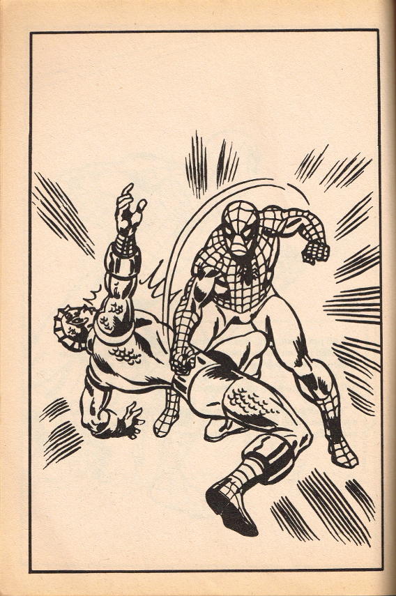
The book is 8" x 11.4", black and white newsprint, 48 pages. The splash page declares the story to be entitled "Spider-Man Swings to the Rescue", but in fact this story is borrowed directly from Spectacular Spider-Man (Vol. 1) #11 and it's true name is "A Life Too Far".
You can read the full review of that original story, but if you're in a hurry, here's the TL; DR.
Peter Parker and Mary Jane are saved from a careering truck by a random stranger, a young boy. The lad ends up in hospital, poisoned by a rare toxic chemical contained in the truck. Only one dose of the antidote exists in New York, and that is stolen from the delivery ambulance by Medusa of the Inhumans. Spider-Man fights the Inhumans, before realising that they were attempting to save the world, not do anybody any harm.
Yeah, it's pretty contrived. It's a comic book story, OK? They're all like that. Comes with the territory.
Anyhow, the original classic (though rather forced and unconvincing) tale is by Chris Claremont. Artwork by the incredibly prolific team of Jim Mooney and Mike Esposito.
In adapting the story, the various key panels have been copied from the original story and blown up to the size of a full page. The associated section of the script has been extracted and printed on the facing page, separated from the art. So there are 24 colouring pages in the book, and 23 pages of plain text.
General Comments
The final result is pretty damn "Meh".
Mooney/Esposito were a great team, and their Spider-Man art work still stands the test of time. But these panels were never intended to be stripped of their color and blown up to fill a page. Still, even subjected to such unkind treatment, most of the artwork is still surprisingly effective.
I can't say the same for the text. Stripped of context and stranded on a mostly blank page, the script does not carry the same impact that it does when embedded within sequential art. The whole thing looks bare, bleak, and sad, like a winter's day in Manchester. Ah, my childhood.
Overall Rating 
The British really got the sharp end of the stick when it came to most things in the 1970's. Their food was crap, their houses were crap, and they had to settle for black and white reprints of Spider-Man comics, and crappy, badly-designed colouring books like this one.
This belongs with the Worst of the Worst. Half-a-Web.